AEG MAXISIGHT
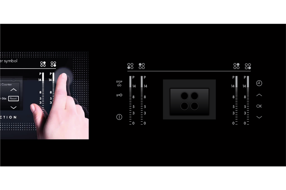
I believe that simple ideas are usually the best. For this project I decided to make the user interface look like the actual hob surface, simple!
The inspiration for this concept started with one picture I found in a architectural magazine. It was a piece of black glass with a thin light shinning through the surface. The precision cut fit perfectly with AEG's brand values.
In my design, I used red light to show the direct relationship between the user interaction and the hob functionality. Whatever selection was made became the focus and would increase in size. Red indicated zone heating or residual heat. The other graphic elements on the screen would remain smaller and in a neutral colour.
This was not a touch screen, it had touch keys, so it was vital that the graphics on the keys were aligned with the functions on the screen. I also developed the horizontal and vertical touch slider graphics which appear on the hob interface.
Reddot winner 2011


